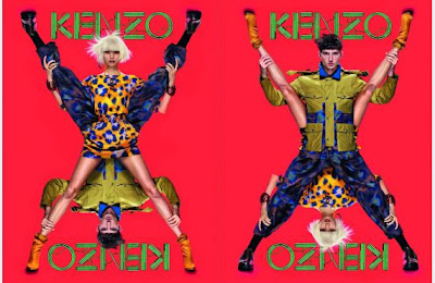
For my series of fashion illustrations, I decided to do something a bit different, and take a figure from an advertisement. (In this case two). The above advertisement for Kenzo clothing range, I took great interest too when reading my new monthly issue of Vogue (May 2013).
I decided that I wanted to chose the figures from this particular advertisement, because of it's unique approach onto fashion photography. I could see so many opportunities of ideas hidden beneath the two figures eg. rotations, symmetry, shapes.
This is my black and white pen drawing that I used from the magazine image, and I then scanned this onto the computer. I am now going to experiment with this same drawing, and put it into a series of different contexts, following one theme of my choice.
Peter Saville is a graphic designer, that works a lot with typography. I think that the concept of this deisgn, is interesting. How ever, I find it rather 2D looking, for what I would like to create. Taking influence from this, I would like to use typography, but make it look much more 3D on the page.
This deisgn by Peter Saville, attracts my attention much more. I love the 'busy' feel to it, and the feeling that some of the detail is jumping out at me. Looking more into the design, I love the comic style of image that is within the writing. The use of typography, inside typography itself gives great attention to detail, and this really interests me. Maybe I could try and interpret a comic style image, into my theme of galaxy some how, but how would I create this?


No comments:
Post a Comment